
Viva Magenta!! Now that the dark days of COVID are behind us, it’s time to celebrate color! And what better way than with Pantone’s Color of the Year, Viva Magenta (18-1750). This is a color that demands attention, signals strength, and exudes confidence. We at PurseBop agree that Viva Magenta is powerful and empowering, displaying “joyous and optimistic celebration”. It also encourages “experimentation and self-expression without restraint.”
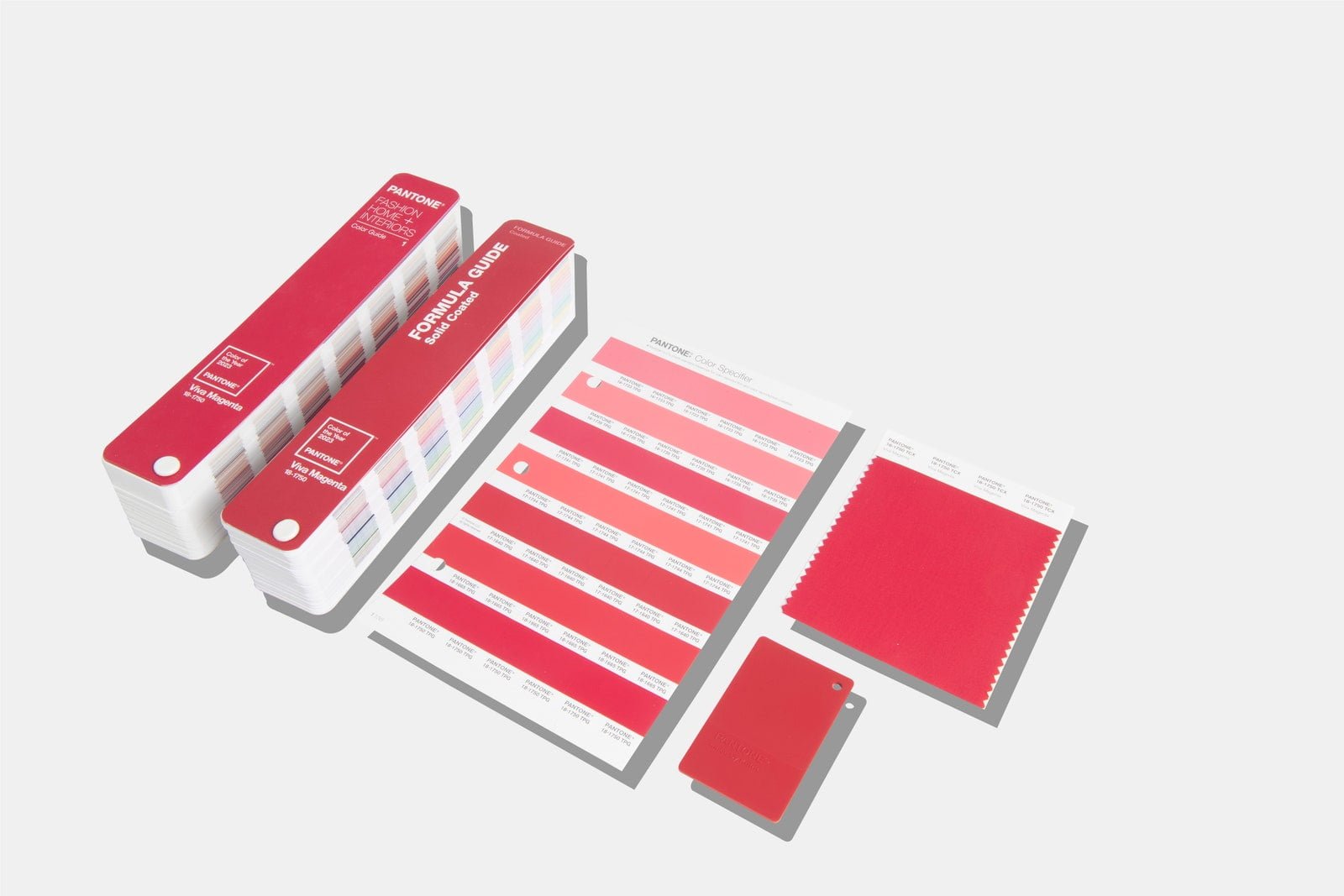
Image Credit: Pantone/Michael Marquand
You know what else we find powerful and empowering, exuding joyous and optimistic celebration? The perfect purse! And what could be a more perfect reflection of experimentation and self-expression without restraint than the perfect Hermès bag! So let’s celebrate two of our favorite things– the Pantone color of the year and Hermès handbags.
Hermès, like Pantone, understands that color is an important powerful communication tool. It is the first thing we see and emotionally connect with. A visual language we all recognize, it is “one whose message crosses genders, generations, and geographies”. And no one speaks this language more fluently than a strong woman carrying a beautiful bag. Let’s explore!
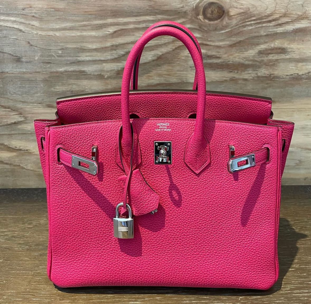
Rose Mexico @myhcatalog
Besides the actual color of the year itself, Pantone includes seven other colors in the “Magentaverse”. These include Pale Dogwood, Gray Sand, Gray Lilac, Pale Khaki, Fields of Rye, Agate Gray, and Plein Air. And we cannot help but notice how Viva Magenta and the other more neutral hues match up with so many on the actual Hermès color chart. It’s time to play one of our favorite games… matching Pantone hues with Hermès leather colors!
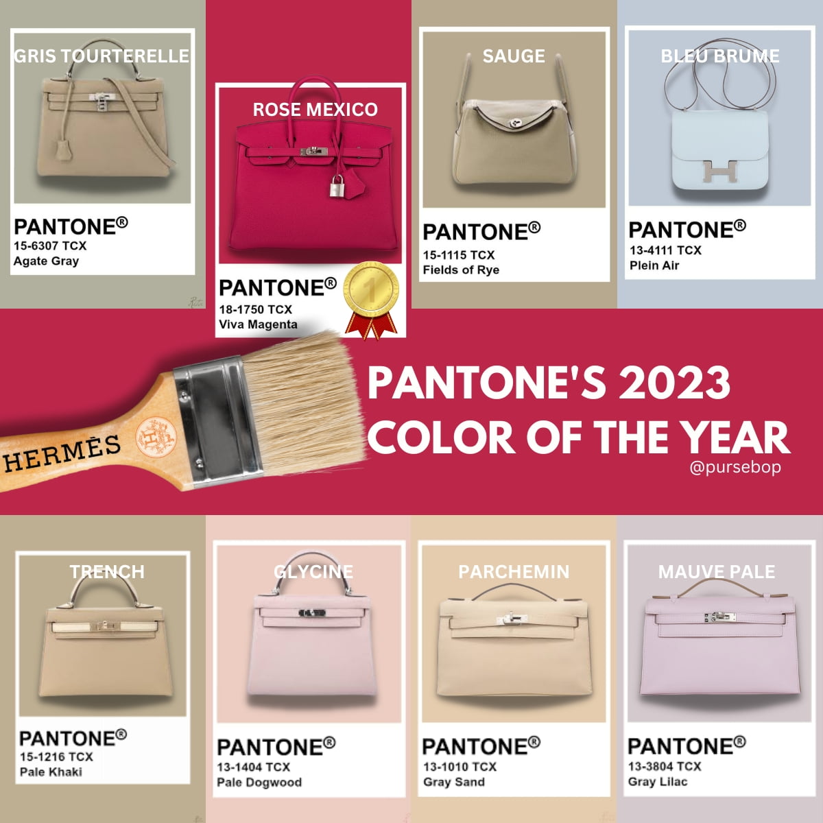
Let’s start with our color of the year, shall we? According to Pantone, Viva Magenta is a “nuanced crimson red tone” that strikes a balance between warm and cool tones. Described as “assertive, but not aggressive”, Viva Magenta does not dominate the color palette but instead takes a “fist in a velvet glove” approach.
The color is a blend of natural richness– fun fact: its organic origins stem from the cochineal beetle, yet it also connects us with the digital world. Being such a vibrant color that seems to be bursting with life, Viva Magenta is a perfect representation of our awareness of global issues including climate change, sustainability, and land protection.
Who knew so much depth could be found in such a burst of celebratory boldness? Hermès knew, that’s who! And just look at the similarity between Pantone’s Viva Magenta and Hermès’ Rose Mexico.
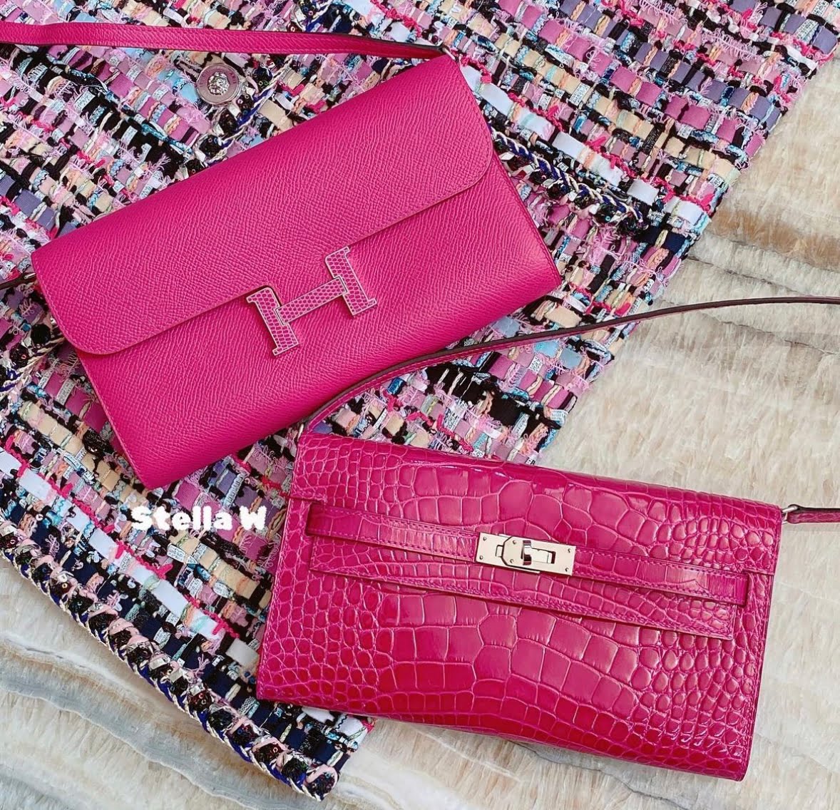
Rose Mexico @stellaw2021
As for the neutrals that Pantone has chosen to complement the Magentaverse, Hermès is ahead of the game on that as well.
Pale Dogwood is a nude neutral with peach undertones which could be described as a dusty or blush peach, almost reminiscent of faded ballet slippers. Wonderfully feminine and understated, Hermès has a similar color in its color wheel – Glycine.
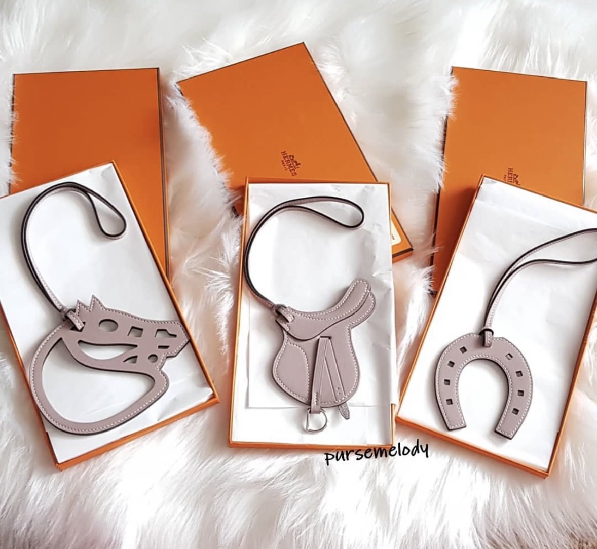
Glycine @pursemelody
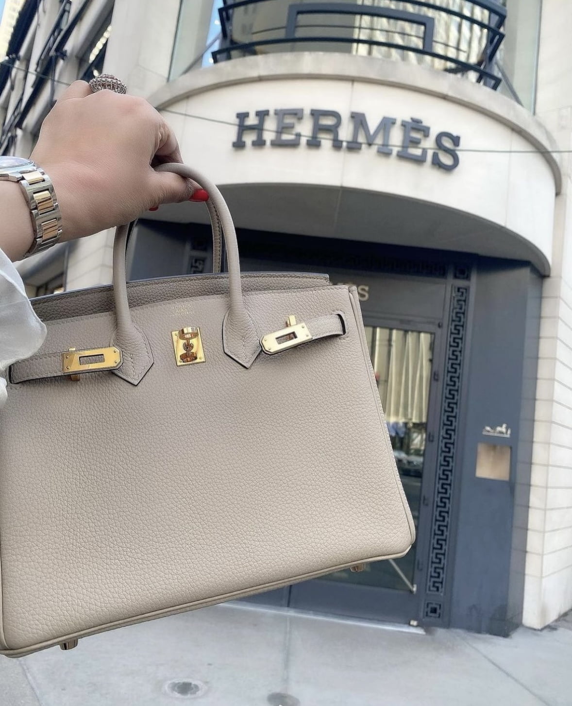
“Gray” sand might be a bit of a misnomer, as the color strikes us more of a beige neutral, reminding us of beautiful Hamptons beaches. A perfectly subtle shade, it brings to mind Hermès’ Parchemin.
Parchemin @fashionphile
Exactly as the name implies, gray lilac is a blend of both colors, resulting in a smoky, elegant hue, feminine but not girly. Recalling the muted colors of the 1930’s or 40’s, one can picture a film noir femme fatale carrying a bag in this color as she meets up with Humphrey Bogart in a dimly lit nightclub in Los Angeles. And if she carried a Kelly, it surely would be Mauve Pale.
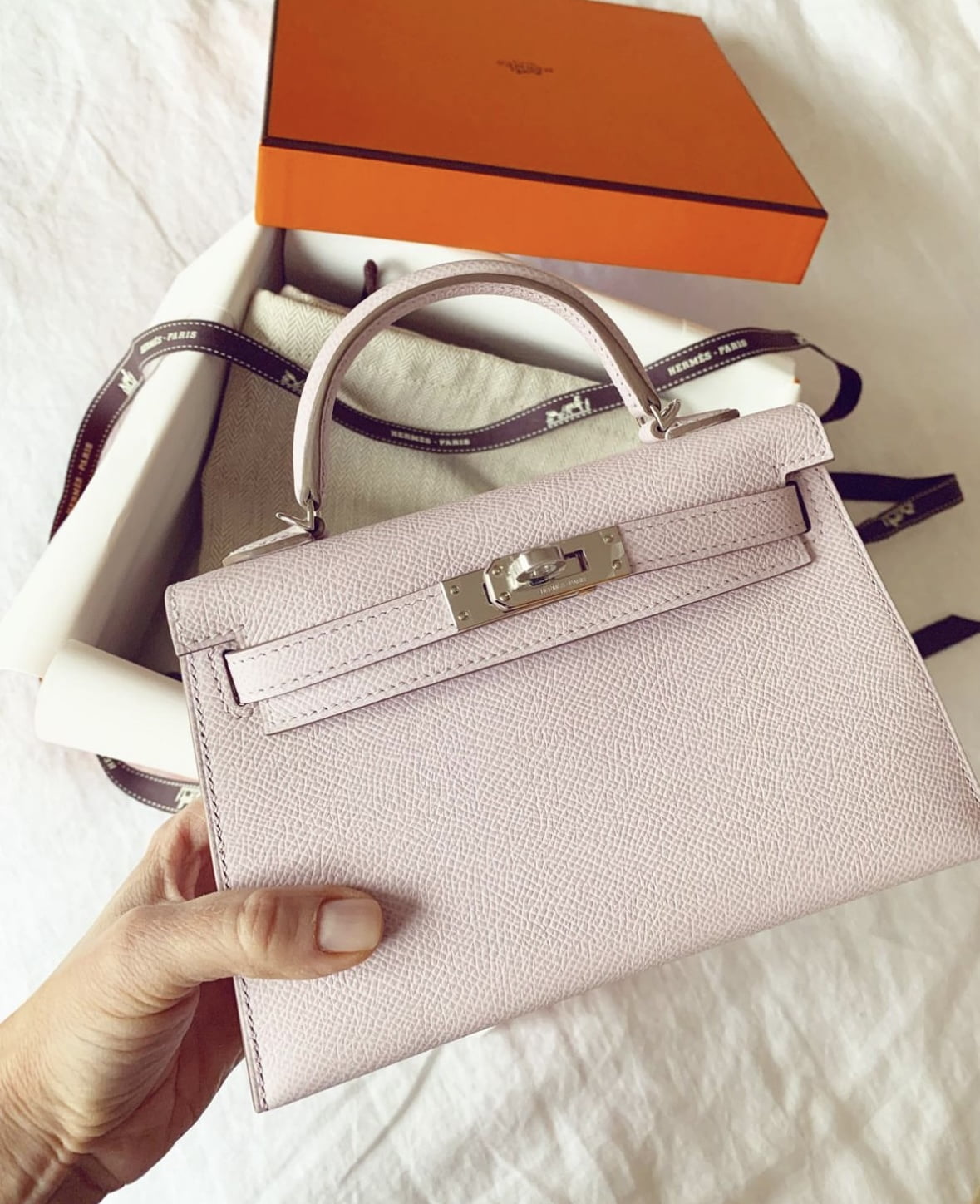
Mauve Pale @wearawishbone01
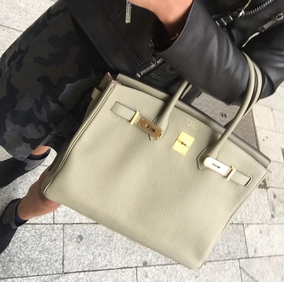
Darker than beige and more muted than tan, pale khaki immediately brings endless desert vistas to mind. While at first it might seem easy to overlook, we find this color to be a useful staple in any wardrobe- appropriate any season, any place, for any event. And Hermès agrees! One of its best-loved newer shades is Trench.
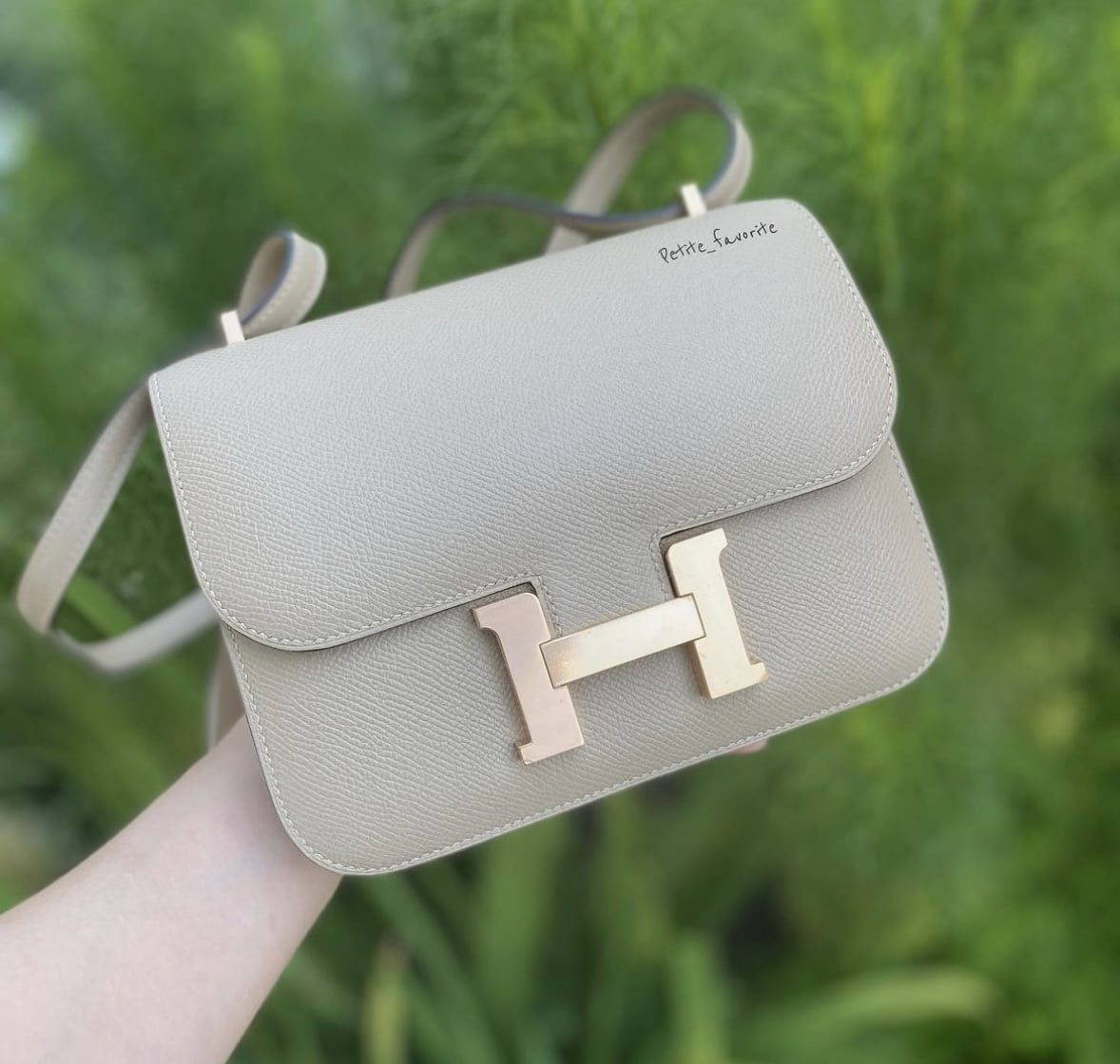
Trench @petite_favorite
Fields of Rye is very similar to pale khaki, but a touch more on the olive side, reminding us a bit of a gin martini. And who doesn’t like to be reminded of a gin martini? Maybe even spiced up with a bit of sage . . . that is, the color Sauge.
Sauge @myhermescollection
Agate Gray conjures images of New York City in the rain, and all the romantic glamor NYC has to offer. Sleek and sophisticated, just like the woman carrying it, Agate Gray immediately evokes the Hermès color Gris Tourterelle.
Gris Tourterelle @pursebop
And finally, a breath of fresh air. Literally. Plein Air (loosely translated to mean outdoors) is a calm, cool morning on a beautiful day. Tasteful and stylish, appropriate for any occasion, Plein Air comes full circle to Viva Magenta’s focus on our natural environment. Plein Air can be found represented on Hermès color chart by icy Bleu Brume.
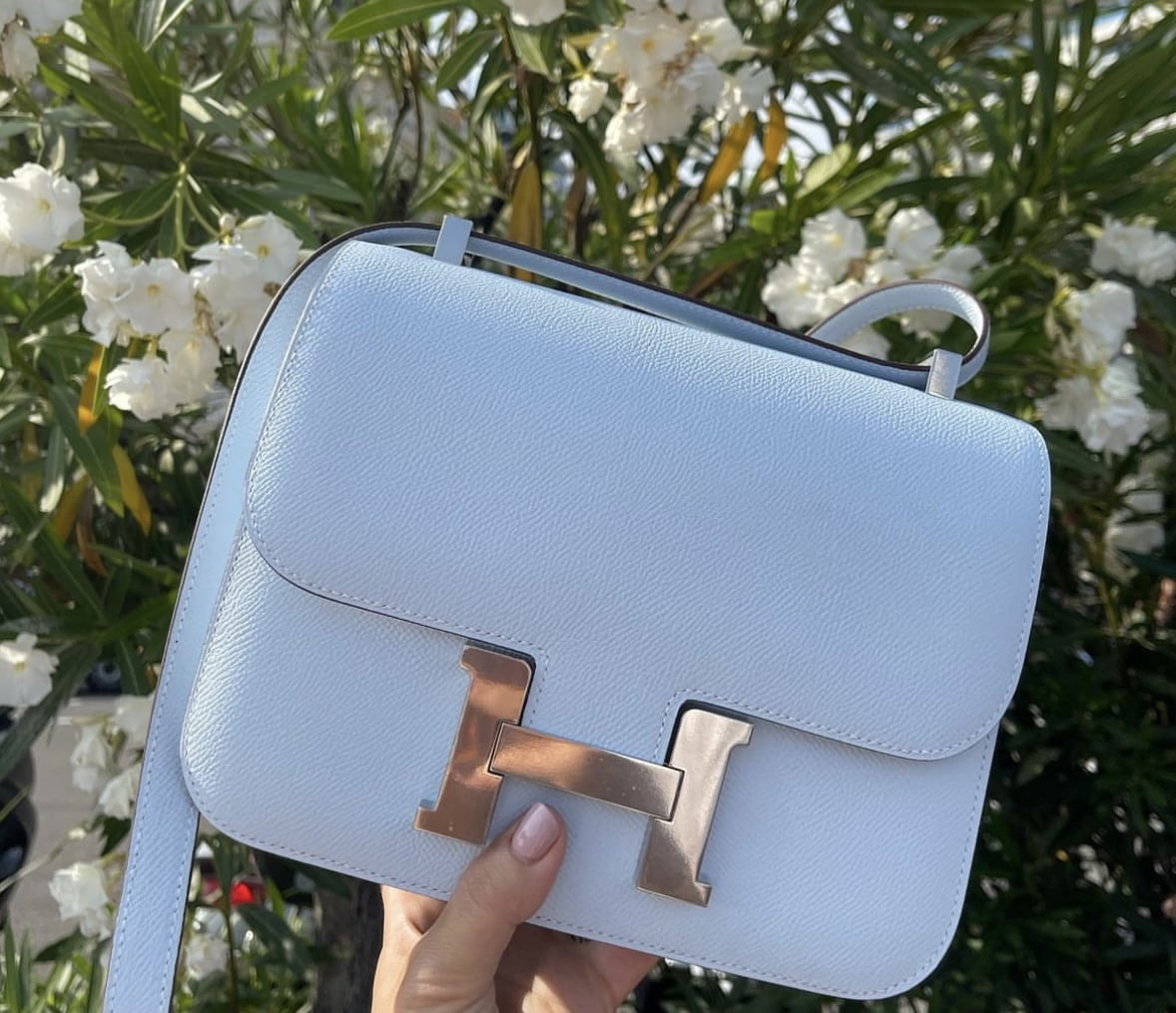
Blue Brume @mtlfashionlover
As always, Hermès is the epitome of taste and style in today’s world, knowing what colors are important and powerful even before they are labeled by tastemakers. Which Hermès color will you be wearing this season?
Read Related Articles:
Pantone’s Take on Hermès Colors 2022
You Voted! Here’s Your Favorite New Hermès 2022 Color
Updated New Hermès Colors 2022
Love, PurseBop
XO


Comments