
We’ve been discussing the topic of neutral colored bags extensively here in recent months. I had a delightful conversation on a related topic with dear @happybaggage prompted by the reveal of her adorable Kelly 25 in the new Hermes fall/winter shade called Terre Battue . Our discussion revolved around a particular concept I’ll call “bright neutrals”: these are the tones that straddle the space between classic neutrals (e.g. greys and beiges) and bright pop colors (e.g. fuschia and green). In general these colors are easier to incorporate into your wardrobe… they blend but don’t clash!
Let’s begin the discussion with @happybaggage ‘s take…
by BopTalk Celebrity HappyBaggage
Say Orange, and it brings on a smile.
Whatever color you like, there must be a shade of it that you love the most. And it doesn’t necessarily have to be a shade you would wear.
I love the Hermes signature orange. I was offered a B25 once, but it didn’t look good on me. On that same day, I tried on a feu jypsiere, and I knew I preferred feu over orange.
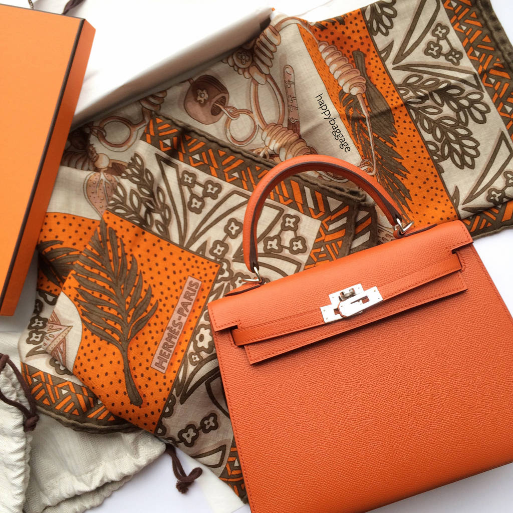
I was still in search for my favorite Hermes orange until I was offered a Terre Battue (meaning ‘clay’ in French) Kelly 25 sellier. I finally discovered that this new shade of orange wears best on me.

The Terre Battue colour can look warm and fiery in the sun, but it is truly a matte and less playful colour indoors. Because of its brown undertones, it is an earthy orange compared to the pop feu, making it a perfect (orange) bright neutral. I fell in love!

I know how ‘bright neutral’ reads like an oxymoron. But in context, I invite you to consider the following examples of ‘bright neutral’ shades in its respective families of brights : ie anemone (in purples), malachite (in greens), bubblegum pink (in pinks).
Read more about neutrals and color theory in The Perfect Neutral-ista feature

In the spectrum of oranges, the differences are quite subtle, and how they wear also depend on the bag style and size. The following image shows the following oranges on different leathers, can you tell which is which? Poppy orange, Feu, Orange, Terre Battue, on Milo, Swift, Chèvre, Epsom.


Hermes Oranges
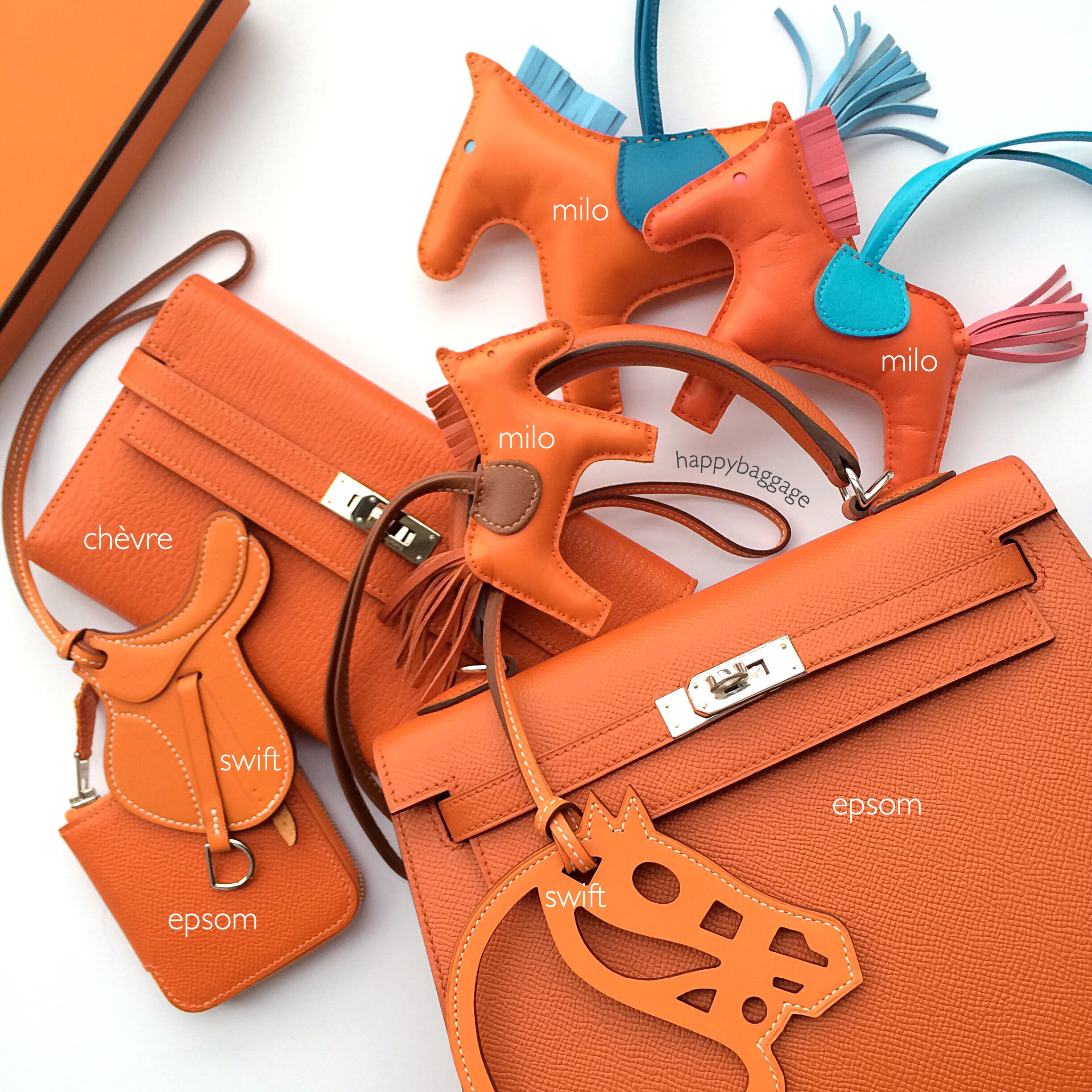
Hermes Oranges on Different Types of Leathers
Join in the conversation on BopTalk, do you also reach out more for your ‘bright neutrals’ these days? Hashtag your ‘bright neutral’ choices to #pursebopbrightneutrals, we would love to see your choices!
Love,
@happybaggage
Read related articles below:
My Orange Baggage Part 1
My Orange Baggage Part 2
A Happy Diorever Review
The Happy Rouge Casaque (RC) Quest
Hermes Happiness
The Perfect Neutral-ista


Updated: June 27th, 2017


Comments
2 Responses to “The Bright-Neutral: Oxymoron or Solution to your Color Confusion?”
Incredible and so interesting! Thank you for the important info!????
I think any bright you like can be a neutral, as long as it has the right undertone and it doesn’t “clash” with what you’re wearing. A neon green bag will be a pop of color, not a ‘bright neutral’ and even a toned down yellow will clash against a bright purple background. It’s just a color theory basic.